Introduction
The function crop_area() is powerful when working with quadrats of different sizes but the same density of points. This vignette will walk through why you might want to crop quadrats based on area and how to go about using the crop_area() function.
When working with quadrats, the area sampled and the density of points sampled will affect diversity measures being conducted. When sampling a larger area, or a differing shaped area, the amount of heterogeneity and number of possible species can differ. Simply averaging the cover of individuals or proportional abundance will be influenced by size of the quadrat, introducing sources of error or variation between samples Anderson and Marcus 1993.
If the identification of substrate and organisms have already occurred for quadrats of different sizes, this vignette can demonstrate how to subset, or ‘crop’ the area of the quadrats all to the same size while maintaining similar effort and comparability between samples. For this the sampling effort needs to be roughly the same per unit area, so that the cropped areas will have the same sampling effort.
If uniform grids of the same area are used to identify the organism or substrate underneath, cropping to a smaller area will be exactly the same effort with the same number of points in each cropped area. Ex splitting each quadrat into 10cm by 10cm squares and identifying the substrate or organism under at the vertexes of the squares.
If random points are used are used to identify the organism or substrate underneath, the density of points will need to be the same per unit area, so that on average, the cropped areas will contain the same number of points. Ex randomly identifying 100 points in a 1m by 1m quadrat and randomly identifying 54 points in a 0.9m by 0.6m quadrat, so both have an average density of 1 point for every cm2 if quadrat area.
If the full area of the quadrat is identified, then the same effort will be applied to any area, though this method of cropping will not be of value.
Additionally, this method is beneficial because it still ensures spatial relationships between organisms within each quadrat. If a subset of the points was randomly selected, like 54 out of the 100 identified points, these points would still cover the whole quadrat and would therefore still be representative of a larger sampling effort, than 54 points out of the 100, but all aggregated in the bottom left corner of the quadrat. This is the method this vignette will explore, and both random and uniform grid points will be displayed.
First, some packages need to be loaded, the quadcleanR package and ggplot2 to help you visualize the data and results.
Randomized Data
First we will start by randomizing data to help illustrate what is going on here. In this example we will randomize 4 quadrats of data. These quadrats will each have 100 identifications within them, each with a random row and column location. We will set the quadrat size as being within a 2000x2000 pixel quadrat, and randomly identify each identification as one of 4 soft coral genera: Cladiella, Sinularia, Sarcophyton and Lobophytum.
#Creating a vector of the soft coral genera
tags <- c("Cladiella", "Sinularia", "Sarcophyton", "Lobophytum")

#Creating a vector of quadrat names
rep <- c(rep("Q1", times = 100),
          rep("Q2", times = 100),
          rep("Q3", times = 100),
          rep("Q4", times = 100))

#Creating a vector of randomized row locations
row <- c(sample(x = c(0:2000), size = 100, replace = TRUE),
         sample(x = c(0:2000), size = 100, replace = TRUE),
         sample(x = c(0:2000), size = 100, replace = TRUE),
         sample(x = c(0:2000), size = 100, replace = TRUE))

#Creating a vector of randomized column locations
column <- c(sample(x = c(0:2000), size = 100, replace = TRUE),
            sample(x = c(0:2000), size = 100, replace = TRUE),
            sample(x = c(0:2000), size = 100, replace = TRUE),
            sample(x = c(0:2000), size = 100, replace = TRUE))

#Creating a vector of randomized identification labels
label <- c(sample(x = tags, size = 100, replace = TRUE),
           sample(x = tags, size = 100, replace = TRUE),
           sample(x = tags, size = 100, replace = TRUE),
           sample(x = tags, size = 100, replace = TRUE))

#Joining vectors into a data frame
coral_annotations <- data.frame(rep, row, column, label)

#Plotting each quadrat
ggplot(coral_annotations[1:100,], aes(x = column, y = row)) +
  geom_point() +
  theme_classic() +
  labs(y = "", x = "", title = "Quadrat 1")

ggplot(coral_annotations[101:200,], aes(x = column, y = row)) +
  geom_point() +
  theme_classic() +
  labs(y = "", x = "", title = "Quadrat 2")

ggplot(coral_annotations[201:300,], aes(x = column, y = row)) +
  geom_point() +
  theme_classic() +
  labs(y = "", x = "", title = "Quadrat 3")

ggplot(coral_annotations[301:400,], aes(x = column, y = row)) +
  geom_point() +
  theme_classic() +
  labs(y = "", x = "", title = "Quadrat 4")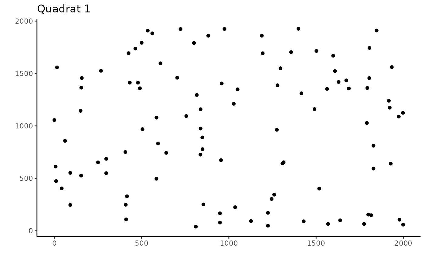
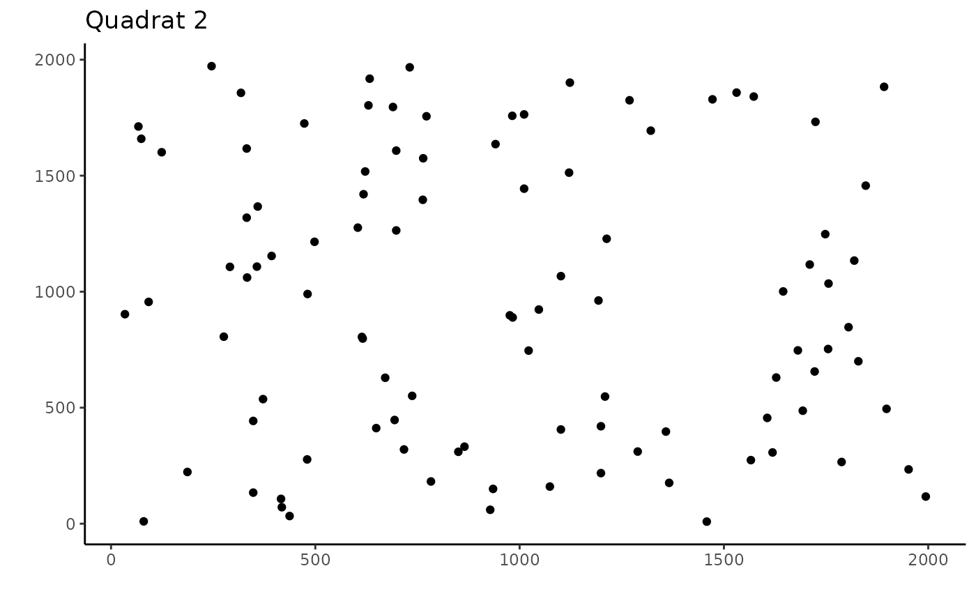
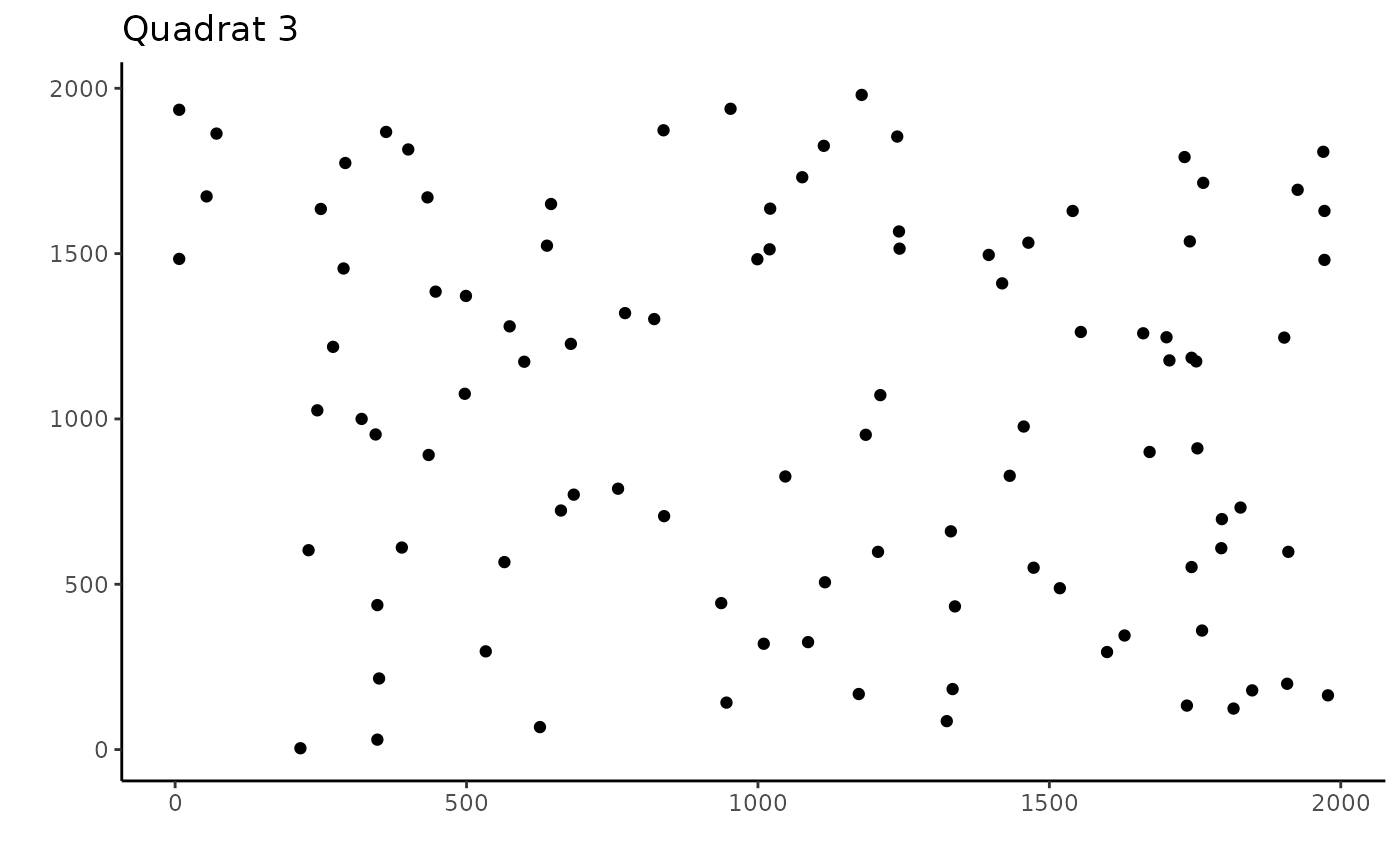
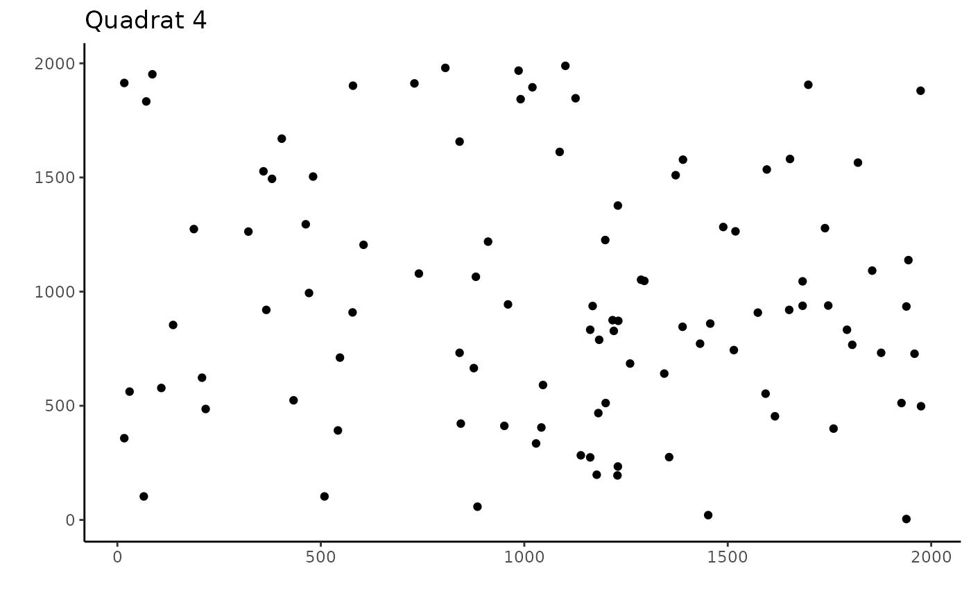
These plots show where each identification was randomly placed within our quadrats. Now we will crop this area to 50% of the original length and width. There are two ways of doing this, the first, if we know haw large each quadrat is, we can specify this exact size, or estimate based on the maximum row and column locations.
First we will examine this by just estimating the size:
crop_area_coral_1 <- crop_area(data = coral_annotations, row = "row",
                             column = "column", id = "rep", dim = c(0.5, 0.5))


#Plotting each quadrat
ggplot(coral_annotations[1:100, ], aes(x = column, y = row)) +
  geom_point() +
  theme_classic() +
  labs(y = "", x = "", title = "Quadrat 1") +
  geom_rect(
    aes(
      xmin = 0,
      xmax = 0.5 * max(column),
      ymin = 0,
      ymax =  0.5 * max(row)
    ),
    color = "black",
    alpha = 0
  ) +
  geom_point(data = subset(crop_area_coral_1, rep == "Q1"),
             color = "red")

ggplot(coral_annotations[101:200, ], aes(x = column, y = row)) +
  geom_point() +
  theme_classic() +
  labs(y = "", x = "", title = "Quadrat 2") +
  geom_rect(
    aes(
      xmin = 0,
      xmax = 0.5 * max(column),
      ymin = 0,
      ymax =  0.5 * max(row)
    ),
    color = "black",
    alpha = 0
  ) +
  geom_point(data = subset(crop_area_coral_1, rep == "Q2"),
             color = "red")

ggplot(coral_annotations[201:300, ], aes(x = column, y = row)) +
  geom_point() +
  theme_classic() +
  labs(y = "", x = "", title = "Quadrat 3") +
  geom_rect(
    aes(
      xmin = 0,
      xmax = 0.5 * max(column),
      ymin = 0,
      ymax =  0.5 * max(row)
    ),
    color = "black",
    alpha = 0
  ) +
  geom_point(data = subset(crop_area_coral_1, rep == "Q3"),
             color = "red")

ggplot(coral_annotations[301:400, ], aes(x = column, y = row)) +
  geom_point() +
  theme_classic() +
  labs(y = "", x = "", title = "Quadrat 4") +
  geom_rect(
    aes(
      xmin = 0,
      xmax = 0.5 * max(column),
      ymin = 0,
      ymax =  0.5 * max(row)
    ),
    color = "black",
    alpha = 0
  ) +
  geom_point(data = subset(crop_area_coral_1, rep == "Q4"),
             color = "red")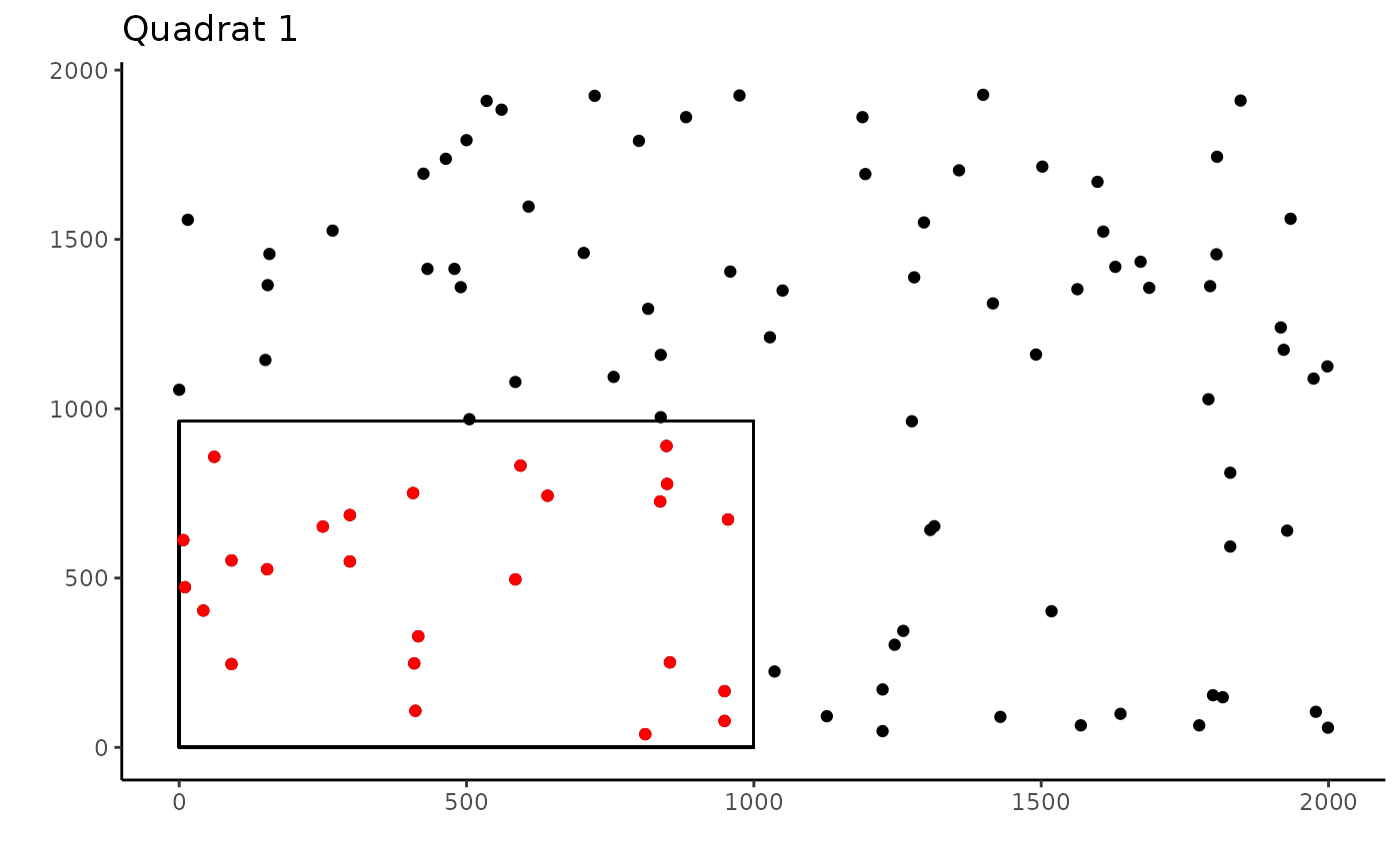
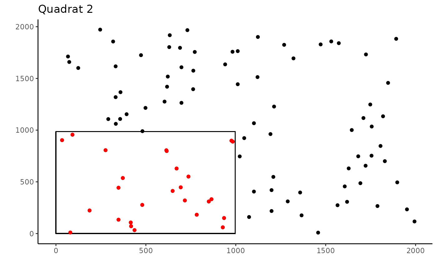
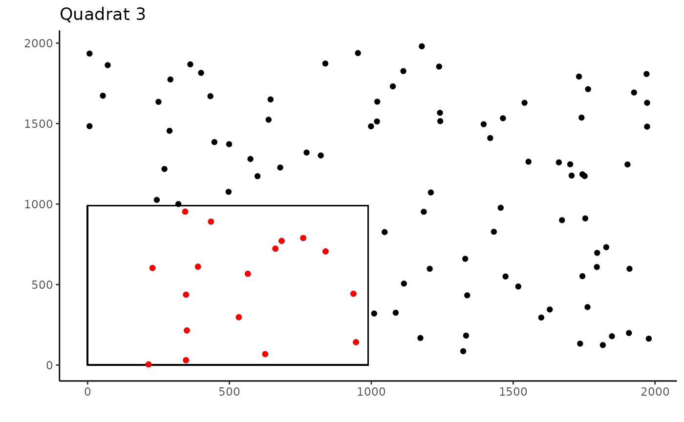

These plots show the cropped coral points in red and the full uncropped quadrats in red, showing how the cropped points are grouped in the bottom corner, maintaining spatial relationships.
Now the same cropping, but specifying the dimensions of the quadrat
coral_annotations[["col_dim"]] <- 2000
coral_annotations[["row_dim"]] <- 2000

crop_area_coral_2 <- crop_area(data = coral_annotations, row = "row",
                               column = "column", id = "rep", dim = c(0.5, 0.5),
                               res = TRUE, res_dim_x = "col_dim", res_dim_y = "row_dim")


#Plotting each quadrat
ggplot(coral_annotations[1:100, ], aes(x = column, y = row)) +
  geom_point() +
  theme_classic() +
  labs(y = "", x = "", title = "Quadrat 1") +
  geom_rect(
    aes(
      xmin = 0,
      xmax = 0.5 * 2000,
      ymin = 0,
      ymax =  0.5 * 2000
    ),
    color = "black",
    alpha = 0
  ) +
  geom_point(data = subset(crop_area_coral_2, rep == "Q1"),
             color = "red")

ggplot(coral_annotations[101:200, ], aes(x = column, y = row)) +
  geom_point() +
  theme_classic() +
  labs(y = "", x = "", title = "Quadrat 2") +
  geom_rect(
    aes(
      xmin = 0,
      xmax = 0.5 * 2000,
      ymin = 0,
      ymax =  0.5 * 2000
    ),
    color = "black",
    alpha = 0
  ) +
  geom_point(data = subset(crop_area_coral_2, rep == "Q2"),
             color = "red")

ggplot(coral_annotations[201:300, ], aes(x = column, y = row)) +
  geom_point() +
  theme_classic() +
  labs(y = "", x = "", title = "Quadrat 3") +
  geom_rect(
    aes(
      xmin = 0,
      xmax = 0.5 * 2000,
      ymin = 0,
      ymax =  0.5 * 2000
    ),
    color = "black",
    alpha = 0
  ) +
  geom_point(data = subset(crop_area_coral_2, rep == "Q3"),
             color = "red")

ggplot(coral_annotations[301:400, ], aes(x = column, y = row)) +
  geom_point() +
  theme_classic() +
  labs(y = "", x = "", title = "Quadrat 4") +
  geom_rect(
    aes(
      xmin = 0,
      xmax = 0.5 * 2000,
      ymin = 0,
      ymax =  0.5 * 2000
    ),
    color = "black",
    alpha = 0
  ) +
  geom_point(data = subset(crop_area_coral_2, rep == "Q4"),
             color = "red")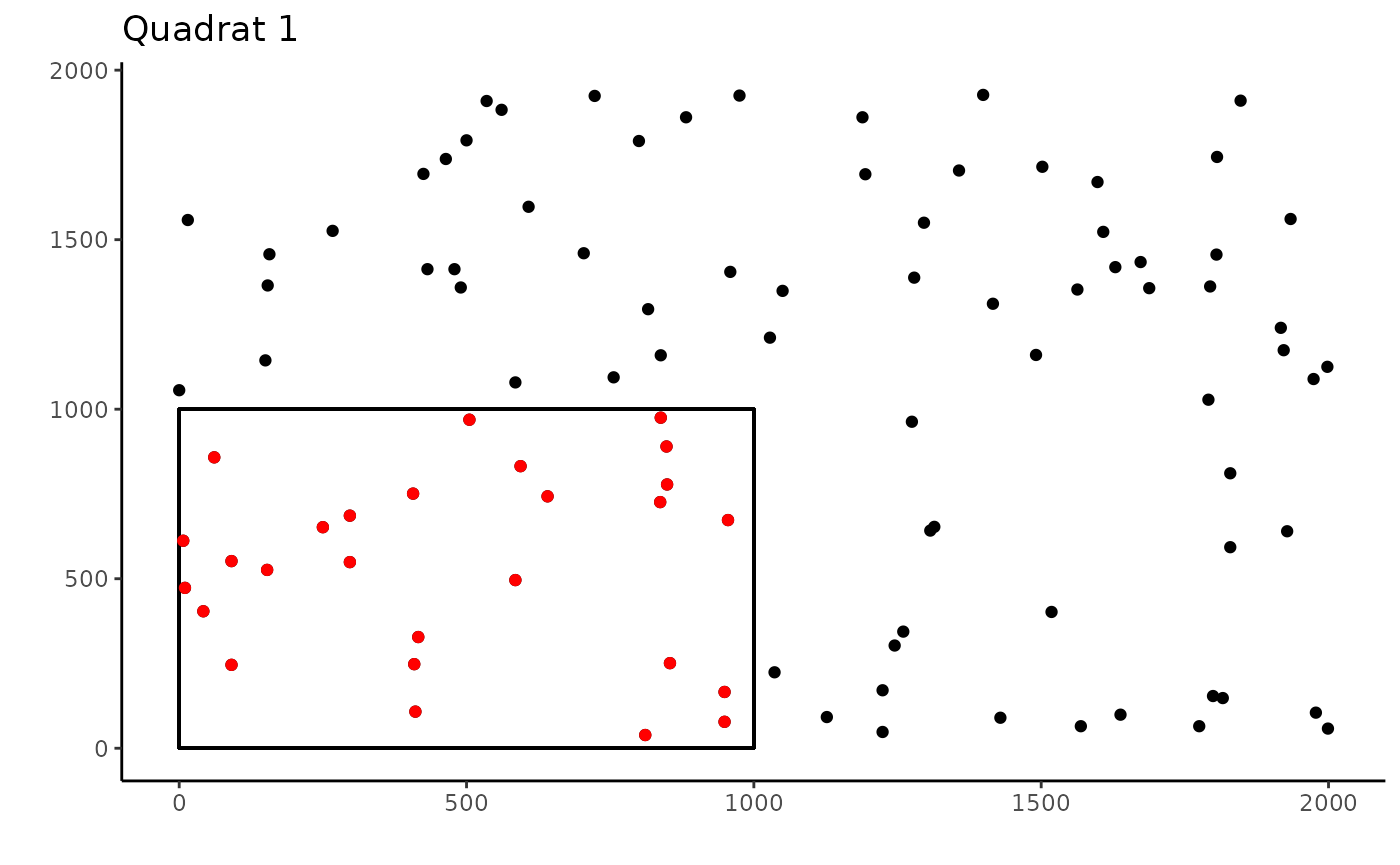
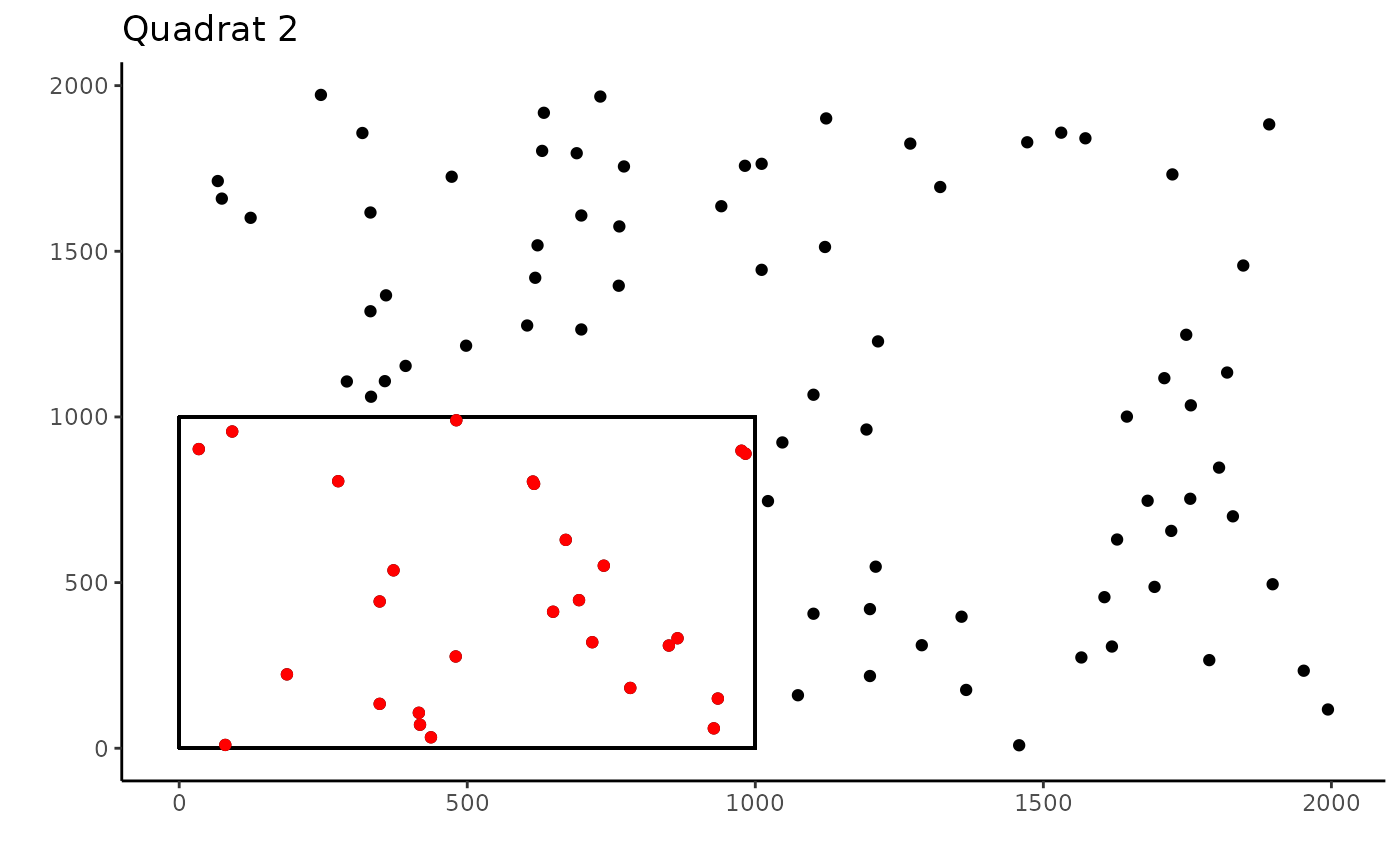
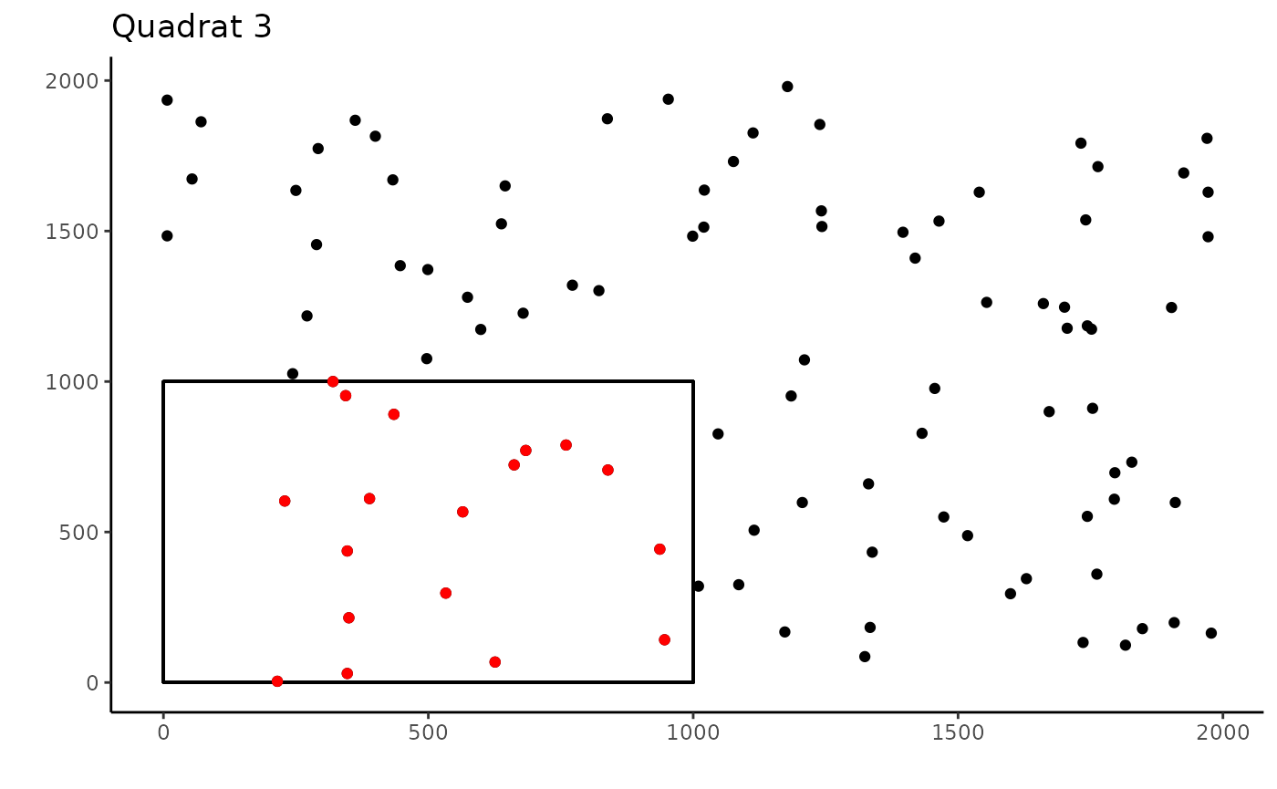
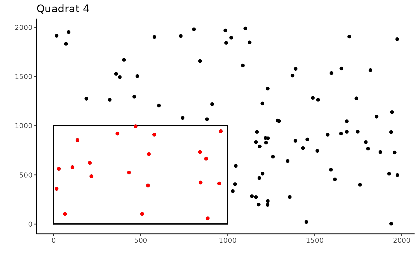
By specifying the dimensions of the dimensions of the quadrat, the cropping will be more accurate than when it is estimated, though as you can see, if the dimension are unknown, which may occur if using photoquadrats and pixel locations, the estimated method is still very accurate.
Coral Data
Now for a real example. This data is published in Maucieri and Baum 2021 and archived in the GitHub repository for the paper. In this study, quadrat sizes were switched in 2013. Prior to 2013, they were 0.9cm by 0.6cm and after they were changed to 1m by 1m. However, these quadrats were randomly annotated, using 54 and 100 points respectively, so that each quadrat had a density of 1point/cm2. This method of cropping quadrats was developed to deal with these different sized quadrats and to make them both 0.9cm by 0.6cm or 54cm2.
First lets load the data.
data(softcoral_annotations)There are quite a few quadrats, which we will visualize the first 4 of as with the previous example
ex_1 <- subset(softcoral_annotations, Name == unique(softcoral_annotations$Name)[1])
ex_2 <- subset(softcoral_annotations, Name == unique(softcoral_annotations$Name)[2])
ex_3 <- subset(softcoral_annotations, Name == unique(softcoral_annotations$Name)[3])
ex_4 <- subset(softcoral_annotations, Name == unique(softcoral_annotations$Name)[4])

#Plotting each quadrat
ggplot(ex_1, aes(x = Column, y = Row)) +
  geom_point() +
  theme_classic() +
  labs(y = "", x = "", title = "KI2013_site14_Q10")

ggplot(ex_2, aes(x = Column, y = Row)) +
  geom_point() +
  theme_classic() +
  labs(y = "", x = "", title = "KI2013_site14_Q11")

ggplot(ex_3, aes(x = Column, y = Row)) +
  geom_point() +
  theme_classic() +
  labs(y = "", x = "", title = "KI2013_site14_Q12")

ggplot(ex_4, aes(x = Column, y = Row)) +
  geom_point() +
  theme_classic() +
labs(y = "", x = "", title = "KI2013_site14_Q13") 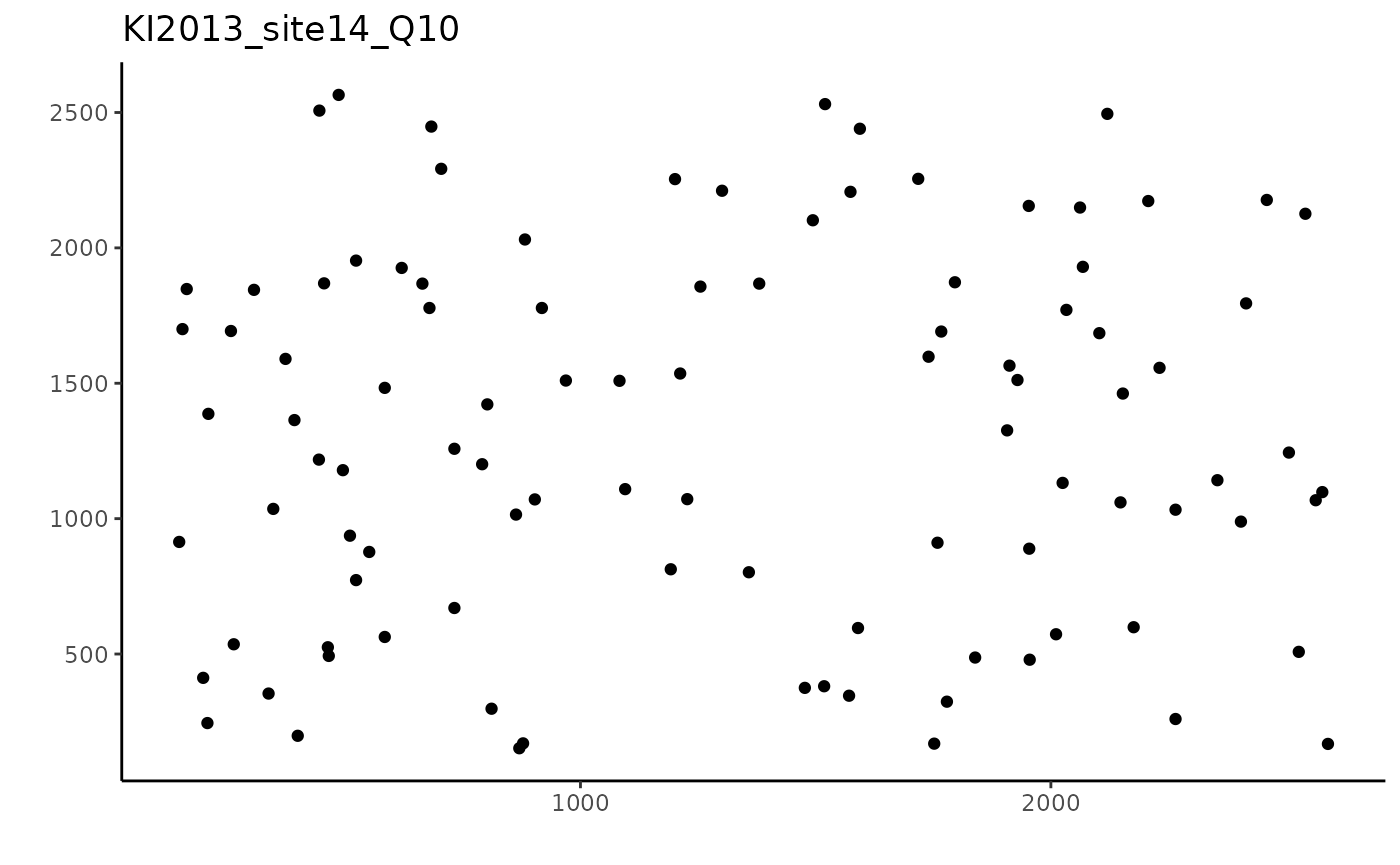
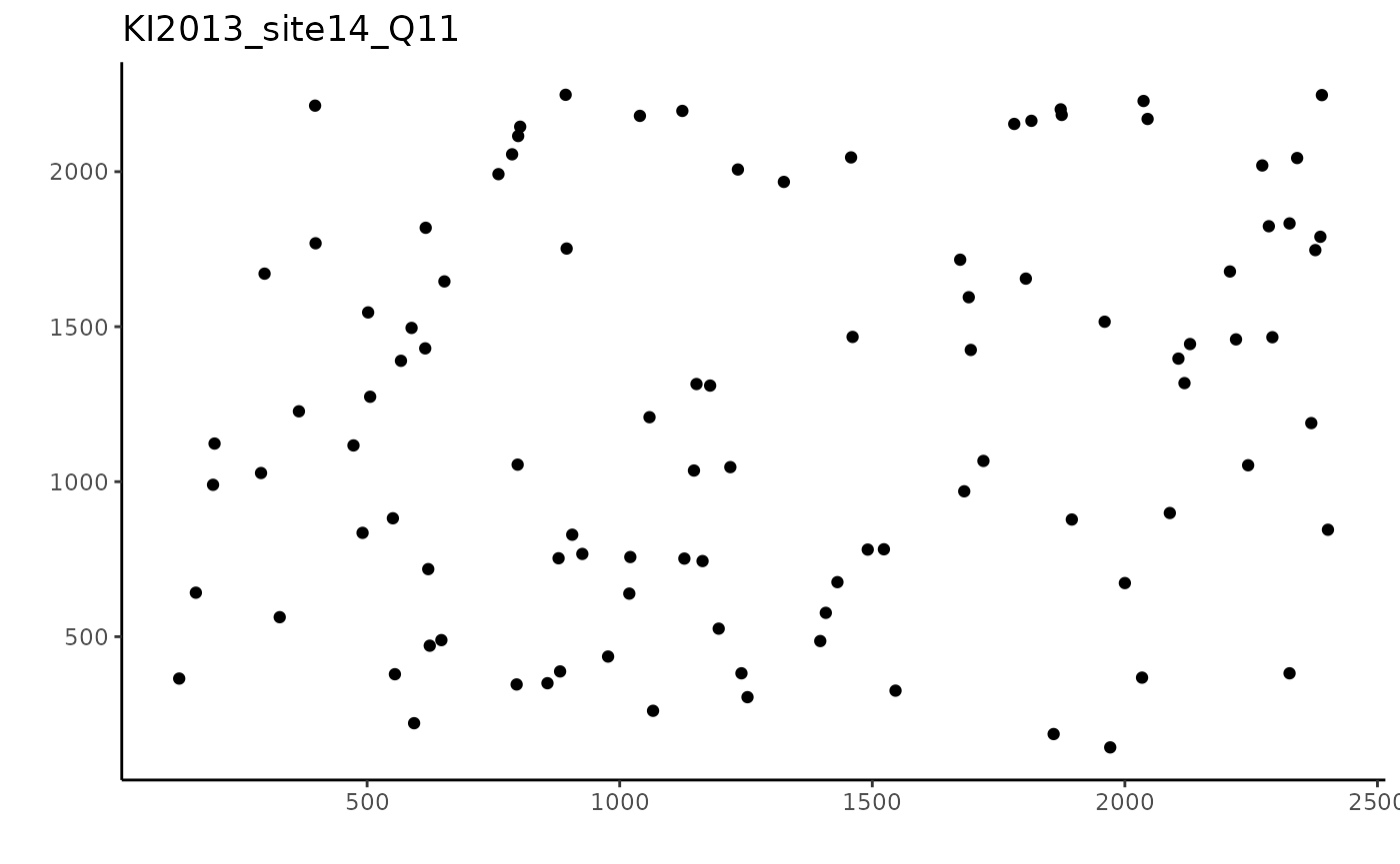
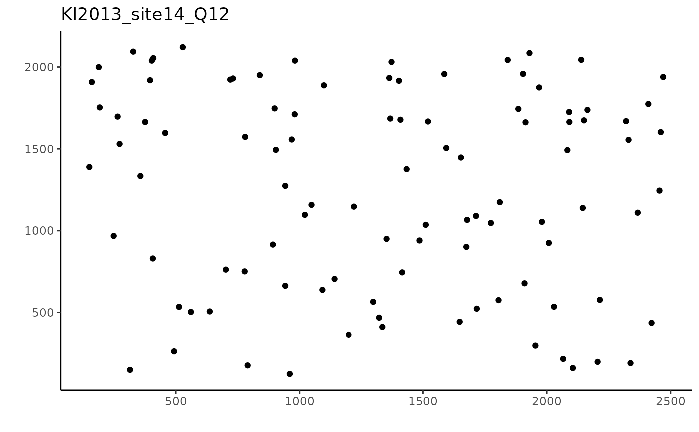
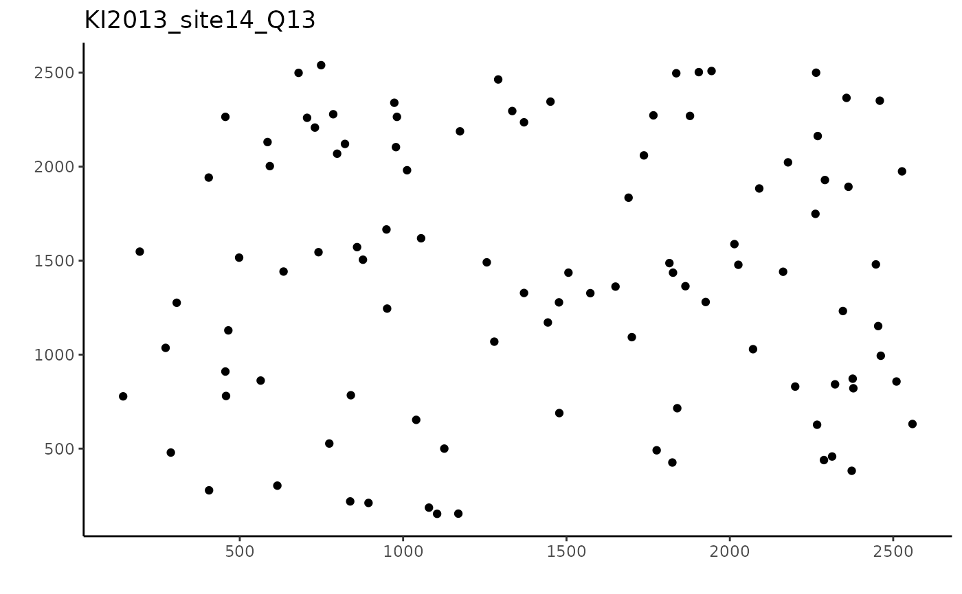
Now what you may notice, is that the axes will differ between the photos. This is because the quadrat photos were cropped before uploading to CoralNet which allowed for easy randomized annotations. Due to this, the number of pixels for each photo quadrat will differ, and is mostly unknown. This is why there is the ability to estimate the length and width in pixels within the crop_area() function.
For this example, I will also be specifying obs_range as being between 36:64, so that quadrats with very high or very low numbers of points within the subsetted area will not be included. Now to crop each of these 1m by 1m quadrats to 0.9m by 0.6m:
crop_area_softcoral <- crop_area(data = softcoral_annotations, row = "Row",
                             column = "Column", id = "Name", dim = c(0.9, 0.6),
                             obs_range = c(36,64))

ex_1_sub <- subset(crop_area_softcoral, Name == unique(softcoral_annotations$Name)[1])
ex_2_sub <- subset(crop_area_softcoral, Name == unique(softcoral_annotations$Name)[2])
ex_3_sub <- subset(crop_area_softcoral, Name == unique(softcoral_annotations$Name)[3])
ex_4_sub <- subset(crop_area_softcoral, Name == unique(softcoral_annotations$Name)[4])


#Plotting each quadrat
ggplot(ex_1, aes(x = Column, y = Row)) +
  geom_point() +
  theme_classic() +
  labs(y = "", x = "", title = "KI2013_site14_Q10") +
  geom_rect(
    aes(
      xmin = 0,
      xmax = 0.6 * max(Column),
      ymin = 0,
      ymax =  0.9 * max(Row)
    ),
    color = "black",
    alpha = 0
  ) +
  geom_point(data = ex_1_sub,
             color = "red")

ggplot(ex_2, aes(x = Column, y = Row)) +
  geom_point() +
  theme_classic() +
  labs(y = "", x = "", title = "KI2013_site14_Q11") +
  geom_rect(
    aes(
      xmin = 0,
      xmax = 0.6 * max(Column),
      ymin = 0,
      ymax =  0.9 * max(Row)
    ),
    color = "black",
    alpha = 0
  ) +
  geom_point(data = ex_2_sub,
             color = "red")

ggplot(ex_3, aes(x = Column, y = Row)) +
  geom_point() +
  theme_classic() +
  labs(y = "", x = "", title = "KI2013_site14_Q12") +
  geom_rect(
    aes(
      xmin = 0,
      xmax = 0.6 * max(Column),
      ymin = 0,
      ymax =  0.9 * max(Row)
    ),
    color = "black",
    alpha = 0
  ) +
  geom_point(data = ex_3_sub,
             color = "red")

ggplot(ex_4, aes(x = Column, y = Row)) +
  geom_point() +
  theme_classic() +
  labs(y = "", x = "", title = "KI2013_site14_Q13") +
  geom_rect(
    aes(
      xmin = 0,
      xmax = 0.6 * max(Column),
      ymin = 0,
      ymax =  0.9 * max(Row)
    ),
    color = "black",
    alpha = 0
  ) +
  geom_point(data = ex_4_sub,
             color = "red")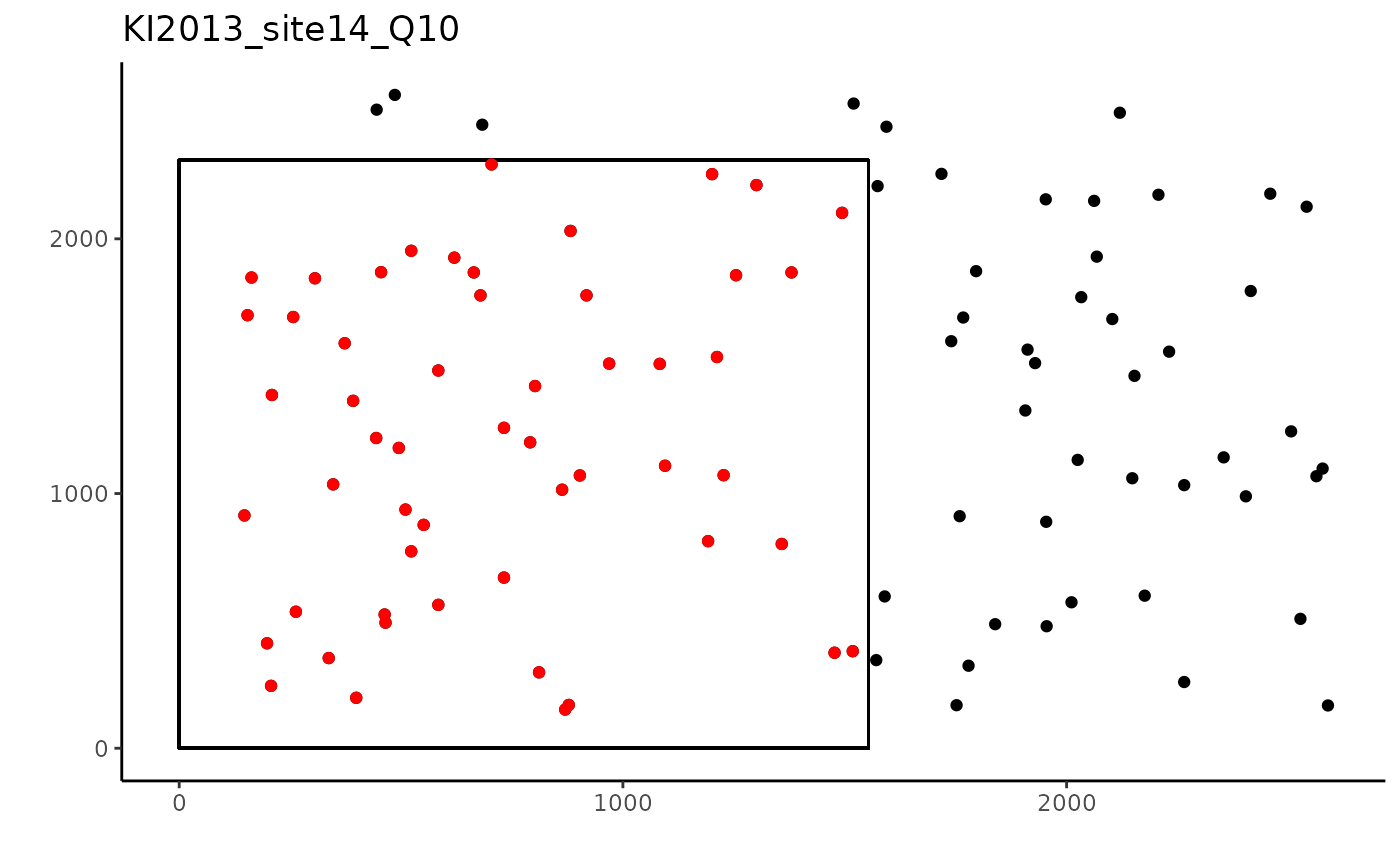
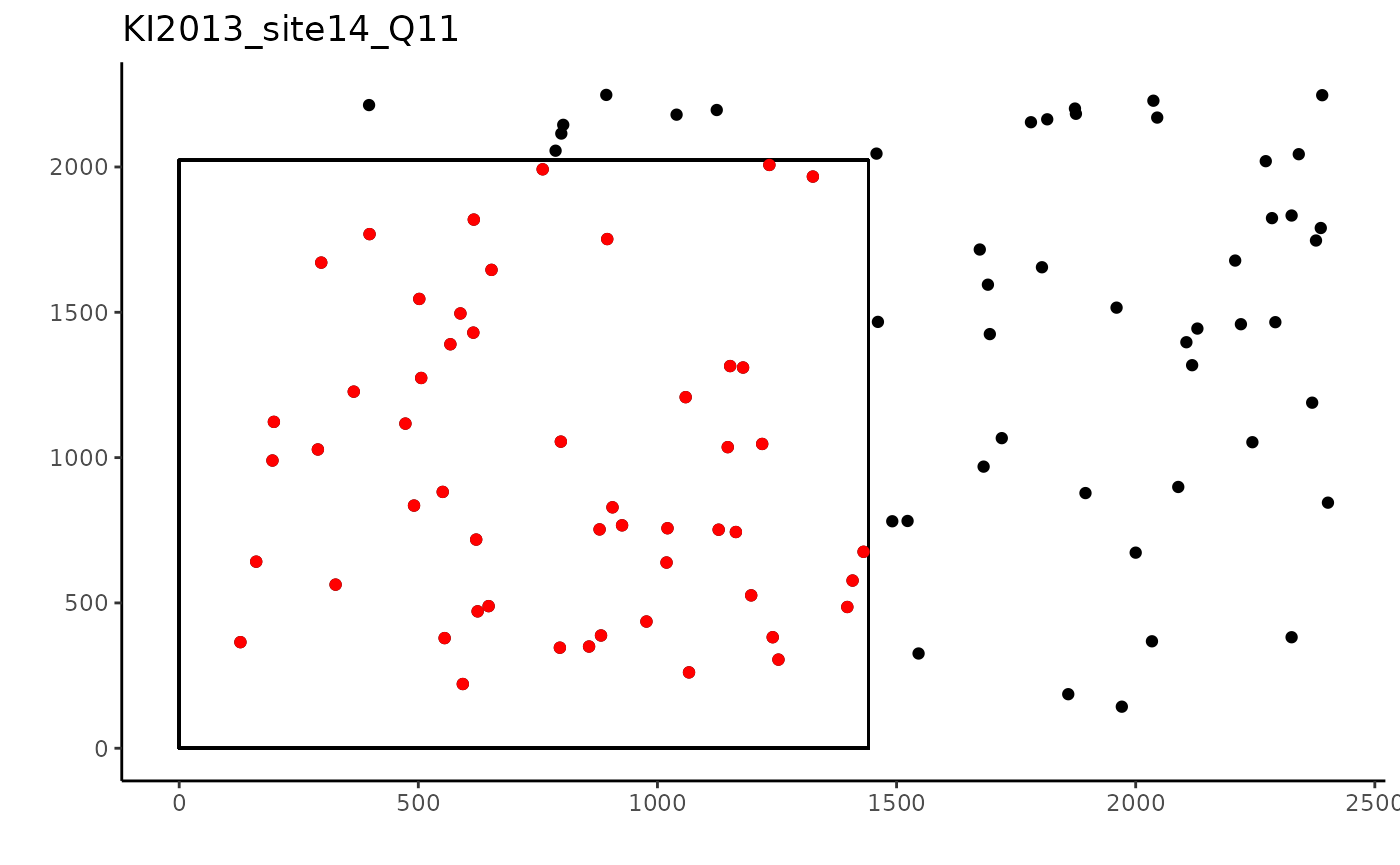
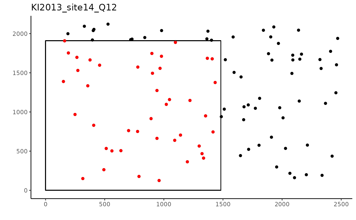
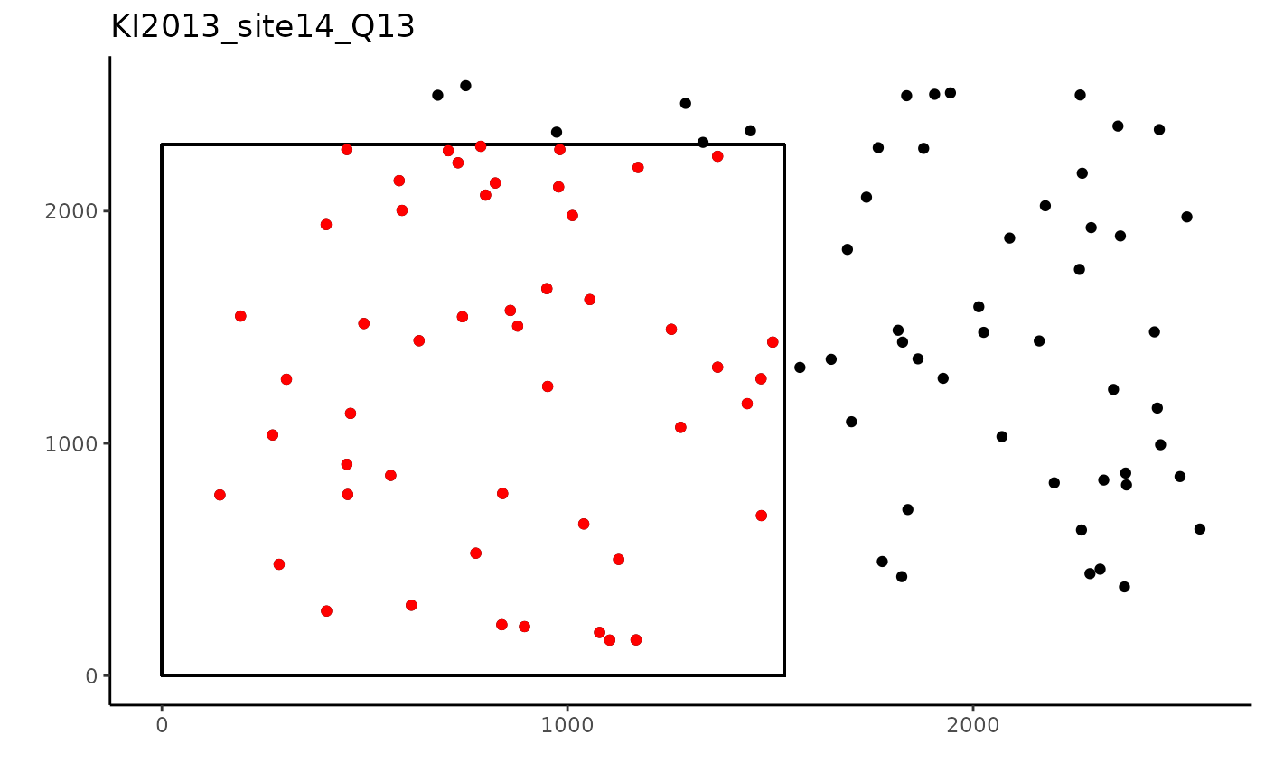
And that’s it, now all the quadrats are cropped to 0.9m by 0.6m quadrats, plus quadrats with a randomly high or low number of points have been removed.
References
Anderson, S., and L. F. Marcus. 1993. Effect of quadrat size on measurements of species density. Journal of Biogeography 20: 421-428.
Maucieri, D.G., and J.K. Baum. 2021. Impacts of heat stress on soft corals, an overlooked and highly vulnerable component of coral reef ecosystems, at a central equatorial Pacific atoll. Biological Conservation 262: 1-10. https://doi.org/10.1016/j.biocon.2021.109328
